Taking a step back and researching the company you are providing insight to is always an important step. What are their business goals, user goals and what UX Principles should be used to support these?
Some of the UX Principles that I like to keep in mind are
- Don’t make people think too much
- Design a satisfying and pleasant experience
- Ensure the people can fulfill the intended goals
When I was working on a redesign project for Scotland’s Cruise Centre I determined that their site was overwhelming and unorganized.
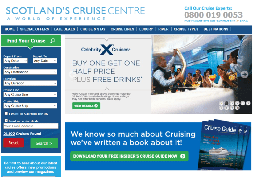
The website did not minimize or maximize very well, the user had to scroll horizontally to view all of the information and the color on each side was distracting.

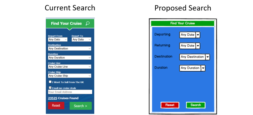
The search options were restricted to dates and destinations and the contact information should include global phone numbers and an email address so as to not limit the customer base.
Card Sorting
There were a total of 81 cards creating using existing information on the current website and there were 3 individuals that participated in the card sorting process. Each individual was asked to create names for each group they created with the cards which would be used as the new navigation title. The individuals spent an average of 50 minutes on the exercise and each noticed the duplicate cards and similar phrases throughout the process and grouped them together rather than splitting them up like the current site was doing.
Analysis of the Data
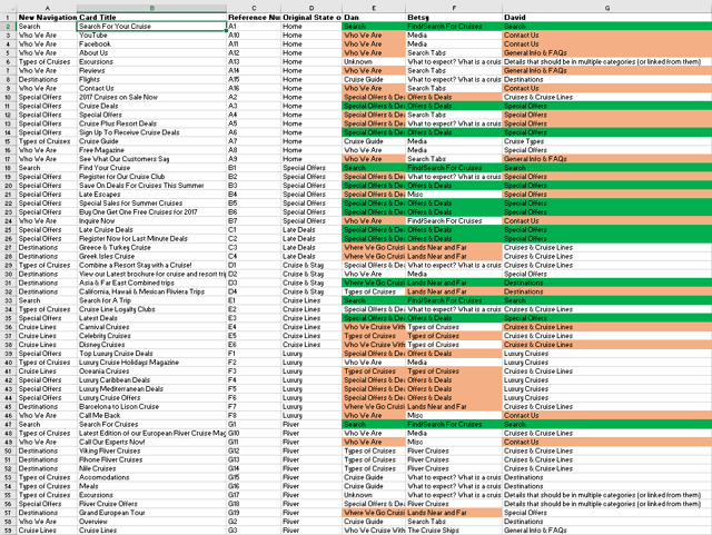
The items highlighted in green represent a match between all three participants and the items highlighted in orange represent a match between two of the participants.
The card sort process allowed for a couple main takeaways: The current navigation has a lot of repetition where each section contains links and information that can be gathered from other sections and some of the titles could be combined to create a more concise navigation bar.
Current Navigation

Proposed Navigation

The proposed navigation bar is more concise while providing the same information which enables the user to determine how they want to use the site rather than feeling overwhelmed.
Although the header and footer are relatively simple there were a couple changes I thought could improve the look and feel.
Current Header

Proposed Header

The proposed header would allow for options of how you would prefer to contact the cruise experts.
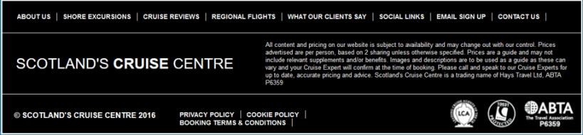
Current Footer
Proposed Footer
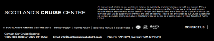
The proposed footer has less information but includes all of the pertinent information as well as a link to Contact Us.
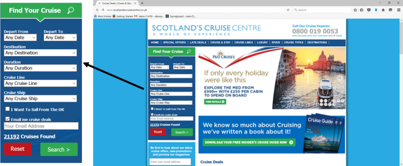
Last but certainly not least the Search options were very overwhelming. What if you were just starting your search and didn’t have all of the details yet? Let’s make it simplified.
After completing the research and the personas I had an idea of what I thought would be the best way to wireframe and design the website. Check out my wireframes here!
This was a hypothetical project designed for people to exchange time as money.
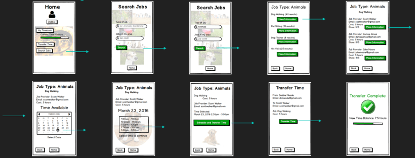
The research began with determining what style should be used and determining how the user was going to electronically exchange time as money. After the first set of wireframes were ready I shared them with a few different individuals to get feedback.

The feedback after the first iteration showed the following:
- There were too many screens that could be used for functions other than transferring time
- There were too many options on the Home Screen – less is more
- Some of the information on the wireframes made the app more complex than was necessary
The conclusion was that the wireframes needed to be more simplistic and more intuitive allowing the user to quickly move through the screens and understand what their goal is.
Here is the second iteration:
The feedback following the second iteration was much better. The users found that it was easy to use and pretty self-explanatory. They thought that it was intuitive, easy to use and navigate and the transfer complete screen provided a sense of confidence that the transaction was complete. Although the users enjoyed the graphics and pictures and said they give it a fun, lighter personality they also noted that the shape of the pictures should be consistent. A third iteration was completed which led to a few word changes and then to a fourth and final iteration. See the final iteration of wireframes here!
